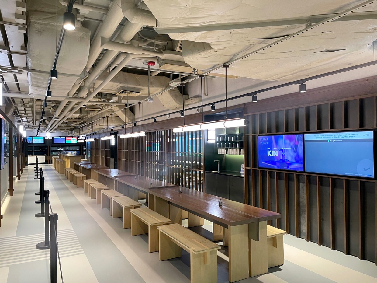
Designing a pickup display that makes order handoff fast and calm. I led UX for Burger King’s in store pickup display. We focused on clear queues, fewer repeated calls, and smoother peaks.
Burger King stores needed a revamp so guests and staff could see the same truth at a glance. Other brands and food courts also needed a pickup display. Burger King was closest to the deadline, but at that time we did not have one product that could fit them all.
From store visits and video reviews we learned:
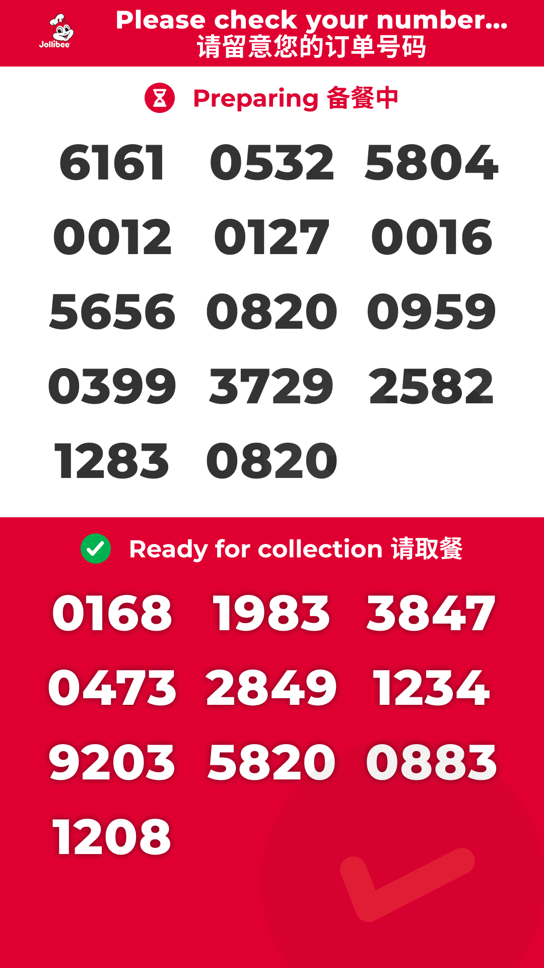
We designed a modular, responsive display that stays readable from far away and adapts per store and per brand.
The new display is live in stores. Guests find orders without asking staff. Staff mark states in one place and focus on handoff.
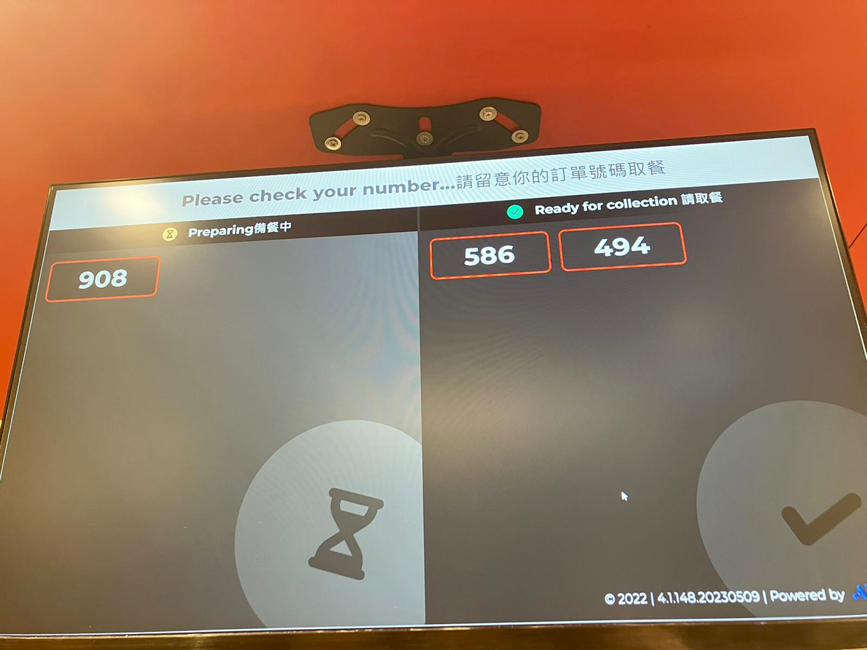
The picture looked different from the mock on day one. The store used a 4K TV. I supported the regional PM remotely to set the TV output to 1920 by 1080, which aligned the layout and spacing with our design.
The TV colors were slightly brighter than our themeThe on site color profile pushed red. After the PM spoke with the Burger King manager, the store kept operating that day and planned to tune the TV color profile themselves.
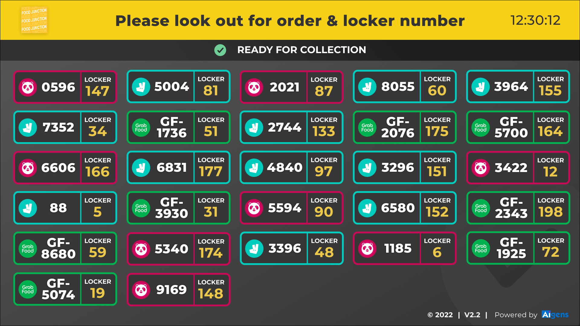
The same display patterns adapt to Food Junction in Singapore and other stores with different screens and layouts
Preparation pays off. Research, technical reviews, and clear requirements with the PM created a product that balances reuse for the company and meaningful configuration for each client. Build the system once and let stores tune what matters without a redesign.